Steelers release their new throwback uniforms for the 2025 season
The Pittsburgh Steelers were slated to release a new throwback uniforms in 2025, and for those who were waiting to see what their new threads would look, the wait is over.
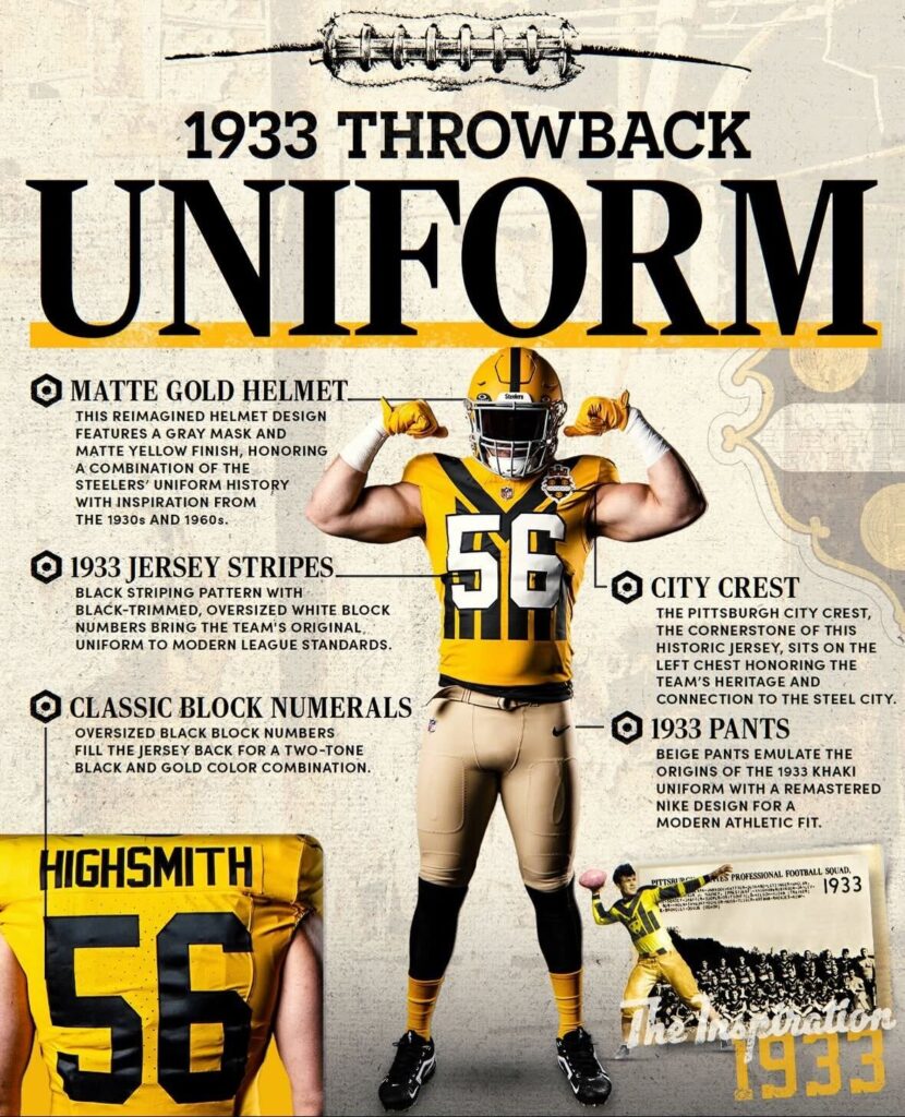
Monday the Steelers announced their newest throwback uniforms, which is a combination of several older uniforms, mainly the 1933 jersey which has the city of Pittsburgh crest on the chest of the jersey.
Check out the video to see the full uniform, including tan pants and a gold helmet:
Forged in Pittsburgh. Defined by Legacy.
📝: https://t.co/9AOP1ZGt7e pic.twitter.com/uNyGGGBYTm
— Pittsburgh Steelers (@steelers) July 21, 2025
The Steelers throwback uniforms will not just feature the gold helmet, which was rumored this offseason, but the gold helmet also has a matte finish with grey facemask and black stripe down the middle. To cap off the look, the team will wear gold socks to accompany the primarily gold jersey.
These throwbacks were worn once before, in the 1994 season, for only one game; however, this is certainly a twist to what was worn back in the Three Rivers Stadium era of Steelers football. To see more behind the throwback, and the design, check out the image below:
Will this be a one year throwback, similar to other throwbacks which have honored past Super Bowl teams, or will the Steelers wear these for more than one year, like they did the Bumblebee uniforms and the gold helmet and white pants throwbacks? We shall see how they are perceived by the Steelers faithful.
In the meantime, let us know your thoughts on the uniforms in the comment section below, and be sure to stay tuned to SCN for the latest news and notes surrounding the team as they head to training camp Wednesday.


That was unexpected. Not sure what I think. I’ll review later.
HUZZAH! My #1. Kinda surprised they didn’t go batwing now, and dust off the 33’s for the 100 year anniversary in 8 years. I think these are badass.
City crest omitted, also not what Alex Lind described, which I didn’t like, admittedly. I’m shocked, bought what Lind sold. ’95s were different, more like rugby jerseys.
My thoughts as well.
in 94 they had the big city crest in the middle, with a small number plate on the shoulder portion of the chest. I assume they reversed them due to the uniform number standards. I like the 94’s way better, but these are still cool.
Yes, ’94. Numbers just don’t look right… I”ll iet it marinate with the chicken. Wish I’d not read Lind, now.
You can see the “new” 33 throwbacks, and the “old” (from 94) 33 throwbacks on the Steelers Pro Shop website. I think the 94’s looks so much better. I will post link in a reply, since it sometimes takes a while to get links approved.
I like these better than the 94’s – it was hard to read the little number on the shoulder.
At first glance I didn’t notice the different color numbers. I don’t like that. They could have made the backs white with a black outline – they’d have read easily.
Steelers Pro Shop Link with the 2025 and 1994 versions of the 33 Jersey.
https://shop.steelers.com/jerseys/pittsburgh-steelers-throwback-jerseys?utm_medium=social&utm_source=pstw&utm_campaign=throwback+jersey+release
Much appreciated, trukk… just in shock, or something. Yeah, I simply prefer the ’94 design, and ought not to have given credence to Lind, that’s what John S mentions.
That report if they will resemble the 2007-2011 throwbacks was off, which I’m glad. Too similar to the color rush. These are a fun throwback. Love a jersey that’s so bad it’s good. The helmets are so clean
Marinating on no crest, I’ll give numerals a chance… there’s rules.
Correction: a small crest on the side w/big white numerals, kind of opposite of ’94. Trukk summarized above. Unexpected.
I’m in the minority here and say I hate them with a passion of 1000 burning suns. Especially the khaki pants and helmet.
Just give me the GD Batman jersey!!! Is it that hard to ask for?
Apparently so… I’m kinda goofed up here, myself.
I love it!
I did update the story on some of the specifics of the jersey.
Still not sure how I feel about it after taking a longer look at them.
White numbers on the front, with black block numbers on the back?
The longer I look, the weirder they are.
So, it’s not just me… maybe I’ll switch to ruminating.
I like the helmet.
Not crazy about the rest of it, tbh.
I think it is cool that they chose to commemorate Aaron Rodgers’ rookie year this way…
They would have gone with his sophomore year in high school, but the Steelers were founding in 33 not 32.
I am fine either way. I am trying to remember if it was the 94 jersey or the bumble bees that the players hated because there was no stretch in the front of the jersey
The bumblebee had that numbered square, dunno. Big Snack hated the stripes.
Thumbs up from me. Good or bad, these have to be the most unique throwbacks in NFL history, no? I can’t remember any other uniforms being so singular.
The Bronco’s AFL throwbacks with the swirled stripped socks were WAAAAAAAAY out there. These are up there with the Bumblebees for sure in “weirdness”.
Yes.
a true Pittsburgh Steelers fan, since the 70’s these uniforms are O.K.
I dunno from beautiful, they seem functional. I’ll acclimate.