The Best and Worst Steelers Throwback Jerseys of Recent Memory
The Pittsburgh Steelers recently unveiled their new throwback jerseys for the upcoming season, bringing back the look from their inaugural 1933 season. Bearing a yellow jersey, khaki pants, and Pittsburgh’s city crest, it is a striking contrast from the modern Pittsburgh Steelers jersey.
While I don’t hate these jerseys, I’m not yet sure that I love them. I’m looking forward to seeing how they look on the field. In the meantime, though, the release has inspired me to rank the Steelers throwback jerseys of recent memory.
1. The Block Letters and Gray Face Masks (1974)

Paying homage to the 1974 Super Bowl champions, these jerseys look great. The block letters and gray face masks bring back a nostalgia for Steelers fans that is unmatched. Those 1970s teams were special, and so are these jerseys. To top it off, they still look great in the modern NFL era. And the yellow-painted endzones that have been paired with these jerseys in Acrisure Stadium? It’s the icing on the cake for me. These are my favorite throwbacks I can remember in my lifetime.
2. 75th Anniversary Season-Inspired Throwbacks (1960s)

Unveiled in 2007 to commemorate the 75th season in Pittsburgh Steelers history, these jerseys were fantastic. The yellow helmet contrasted with the black jerseys so well, and it was a unique, yet aesthetically pleasing look. I personally am partial to these jerseys because they were worn at a time in Steelers history where the team had great success. The teams of this time of course appeared in two Super Bowls. They also rostered many greats including James Harrison and Troy Polamalu. Both men brought home Defensive Player of the Year honors during the years these jerseys were worn.
As a kid, I loved watching night games when the Steelers suited up in these jerseys!
3. The Block Letters with Black Face Masks (1970s)

If it weren’t for the fact that I like the block letters so darn much, these jerseys would be lower on my list. Worn for the 2023 season (and technically for the 2022 season paying homage to the 50th anniversary of the Immaculate Reception), these jerseys looked slick. Who didn’t love those block letters running out of the tunnel contrasted against the yellow-painted endzones? I was fortunate enough to attend the Christmas Eve game when Franco Harris’ jersey was retired (RIP Franco). These jerseys certainly have some sentimental value for that reason, and I’m sure that goes for other fans besides me. In my opinion though, the gray face masks really make this throwback. The black ones look fine, but the nostalgia just isn’t there, and it looks too much like the modern-day jersey. I still loved them, but the use of the black face mask landed them lower on my list.
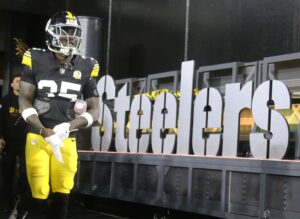
4. 1933 Throwback

Unveiled this offseason and set to be debuted against the Green Bay Packers in 2025, the jury is still out on these jerseys. I gave them a slight edge over the bumblebees, however, simply because it was marketed so well. What can I say? I’m excited for football to be back, and the Steelers hype video really hits. What Steelers fan wouldn’t get a fuzzy feeling looking at these new jerseys highlighted against the background a steel mill? There’s something about honoring the tradition of a blue-collar city, quite literally forged in steel, that loves its football team so much. It brings out the Pittsburgh pride.
While I feel like the yellow jersey and the yellow helmet is just too much yellow, I do really like the Pittsburgh city crest. I also think these uniforms would look better with something other than khaki-colored pants, but then I guess that would ruin the throwback to the 1933 jersey. I’m hopeful they’ll look better on the field, and in the meantime, I’ll just keep watching that hype video.
5. The Bumblebee Jerseys (1934)

Unpopular opinion, here, but I actually liked these jerseys a lot. They were so ugly they were cool. A throwback to the jerseys worn by the team in 1934, it was difficult to decide if the Pittsburgh Steelers looked more like inmates or bumblebees in them. Plenty of people absolutely hated them. However, it was fitting that they wore these during the era of “The Killer Bs”. The numbers themselves on the jerseys really popped. They were extremely unique and different from the modern day jersey. For those reasons, I liked them.
I will never forget the game that Ben Roethlisberger tossed 6 TDs against the Indianapolis Colts in his bumblebee attire. There were some great memories made in these uniforms. While they are ranked at the bottom of my list, in my opinion, there’s no such thing as a bad Steelers jersey! I would take the bumblebee jersey every day over anything purple and black.
What do you think of the list? Would you have ranked the throwbacks differently? Do you have a favorite memory attached to these jerseys?
Make sure to join the discussion below!


I bought the new 1933 throwback (got a Heyward) and the original 1994 throwback of the 33 Jersey (Woodson). They are so ugly they are great. I could definitely sneak into any soccer game or penitentiary unnoticed.
Link to a pic of them side by side. (link is below, its just black.)
https://imgur.com/a/XmHlaMV
I still prefer the 1994 edition of the 1933-era uniform over this ’25 edition. Uniform numeral sizing rules be damned.
I agree. I like the big city crest, and the small number on the shoulder.
I love the Bumblebees! Hands down the best “throwback” uni in all the land. They should wear the faux leather helmet like the packers are wearing this year next time they put these gems into the rotation.
I really like the new one a lot, buuut wish they’d have made the numbers on the back the same white with black outline as the front.
I agree there’s no bad Steelers uniform – I love them all.
The different colored numbers on the new Throwbacks is weird. The pants are not great either. I never picked up a bumblebee back in the day, so I grabbed a new throwback to not miss out. I need to try and find a bumblebee at some point; I am definitely in the Bumblebees are awesome camp.